
Breaking Boundaries or Garanimals for Drinkers?
Love it or hate it, this redesign opens up a bigger conversation about bourbon branding, usability, and how whiskey companies are trying to stand out in a market that’s only getting louder.

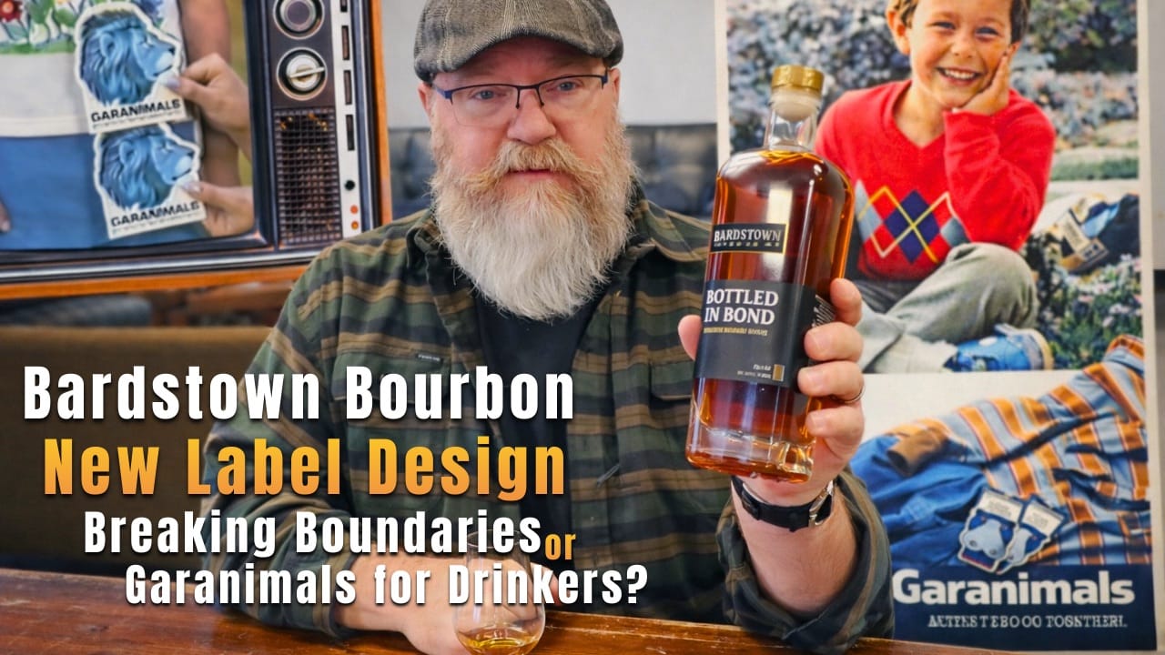
Bardstown Bourbon Company just rolled out a brand-new label design, and let’s just say… it stopped me mid-scroll.
In this video, I break down Bardstown’s new bottle labels, why my first reaction was basically “what the hell is this?”, and why after actually thinking about it (and staring at them like a guy who just turned 54 😎), I believe this might be a seriously smart move.
We talk about:
- Why bold, simple whiskey labels might win in a crowded bourbon market
- Shelf visibility, bar visibility, and the reality of aging eyeballs
- Brand recognition vs. logo recognition
- Why labels don’t change what’s in the glass (no matter how pretty they are)
- And why more whiskey selling = more cool whiskey for all of us
I’m not judging this redesign as a graphic designer would. I’m looking at it like a drinker, a marketer, and someone who spends way too much time staring at back bars in dim lighting.
Love it or hate it, this redesign opens up a bigger conversation about bourbon branding, usability, and how whiskey companies are trying to stand out in a market that’s only getting louder.
So pour a glass, old label or new label, and let’s talk about it.